Proposal Comparative Analysis
This report contains two visuals and a table that facilitate comparative analysis of proposals. The section was designed to help answer the following questions:
- Am I meeting my proposal submission goals for this year?
- How am I doing with proposal submissions through a particular month as compared to the same quarter (or month) last year?
- How am I doing year-to-date on awarded, pending, and not funded proposals, compared to the same quarter (or month) last year?
- Are there any trends in award rates for certain months, and can these trends be associated with other factors? for example, is there increased or decreased success when proposals are submitted close to deadlines?
Visuals
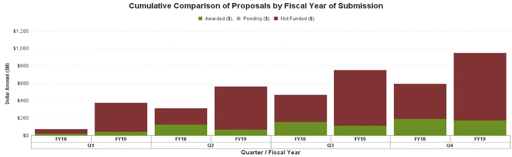
This visual shows the total dollar amount or number of proposals by the fiscal year of submission for the following categories: Awarded, Pending, and Not Funded. The information shown is cumulative and shows a breakdown, by month, across multiple fiscal years.
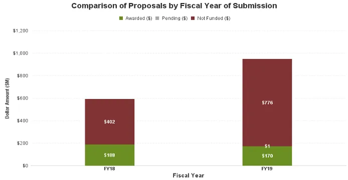
This visual shows the total dollar amount or number of proposals by the fiscal year of submission for the following categories: Awarded, Pending, and Not Funded. The information shown is year-to-date in each fiscal year.